Tennis Clash
Role:
Consultant
Year:
2019
Responsibilities:
● As Wildlife Studio's first UX hire, I was brought in to demonstrate how the user-centered design process works in game development: understand the problem, define the problem, ideate, prototype, and test
● Assess the Lineup feature and recommend improvements based on research and interviews with key stakeholders
● Define the roles of UX and advise on strategy
Lineup Redesign
To better understand the problem, I first asked questions with key stakeholders who were most familiar with the feature. I took the responses I got and sythesized down into a summary. Then, I established principles and the purpose of this UI.
From here, I reviewed a collection of some of the best-in-class comps. I noted what worked well and what didn't from what others were doing with similar features. From here, I was able to establish pain points and opportunities to then begin translating into visual wireframes and tangible prototypes.
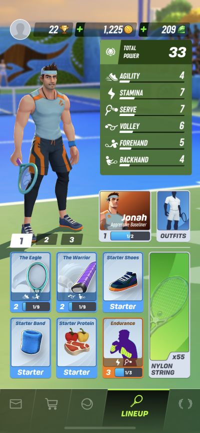
Pain Points
- Strings don't read like a button; little importance here though
- Feels bad when item selection breaks context
- Character feels disconnected
- Icons aren’t immediately clear
- Not clear that strings are a consumable compared to the other items
- Upgrade badges can create a lot of noise since they don’t clear
Original
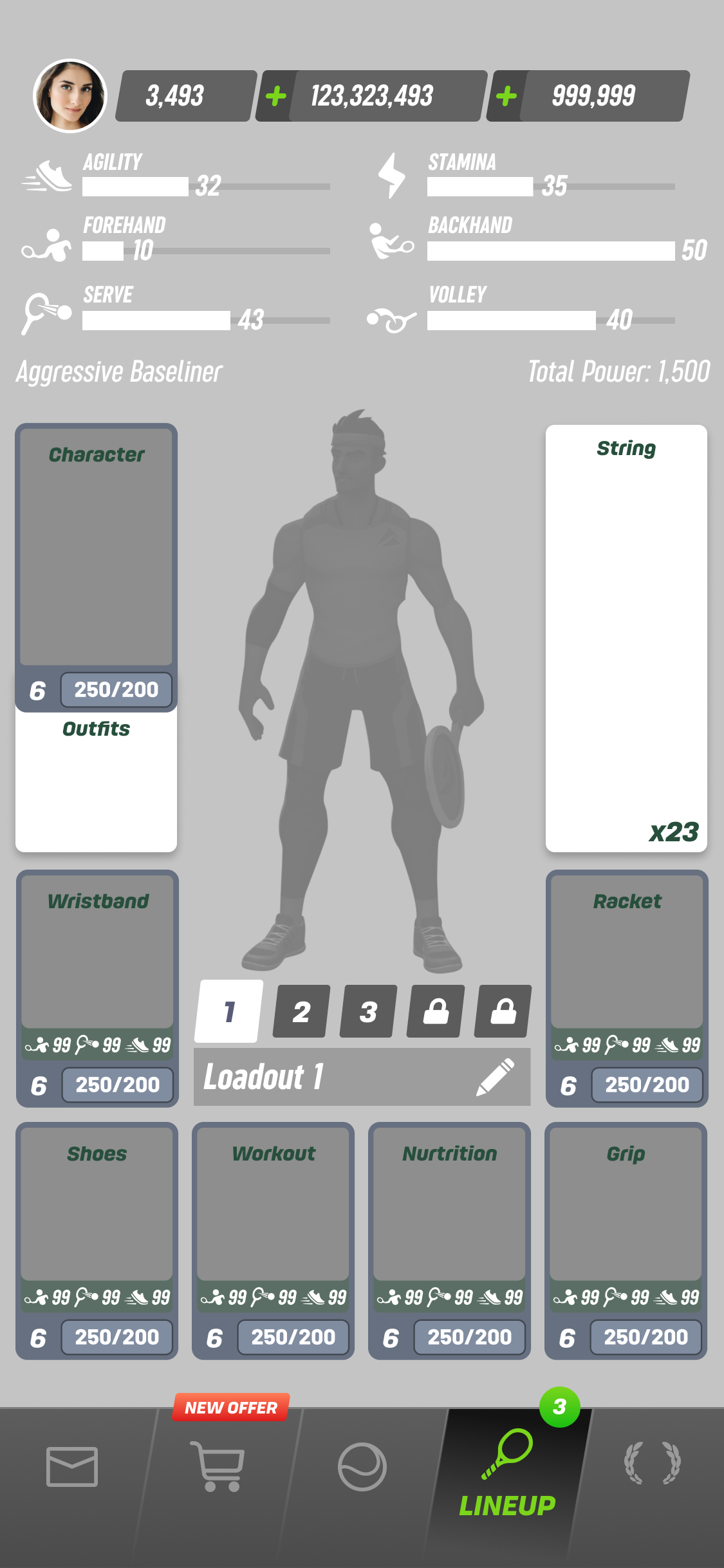
Opportunities
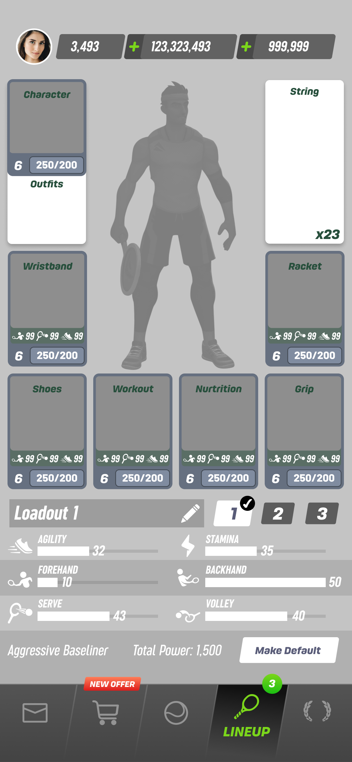
- Improve clarity of currently selected/active lineup
- Improve clarity of items currently equipped on your player
- Don’t break context when changing gear (don’t obscure stats)
- Improve information hierarchy, de-emphasize Total Power
- Improve grouping (related to above)
- Surface player archetype
- Allow players ability to name their loadouts
- Find opportunities to streamline user flow
- Make clear which lineup is active
- Show delta in item stats
Wireframes
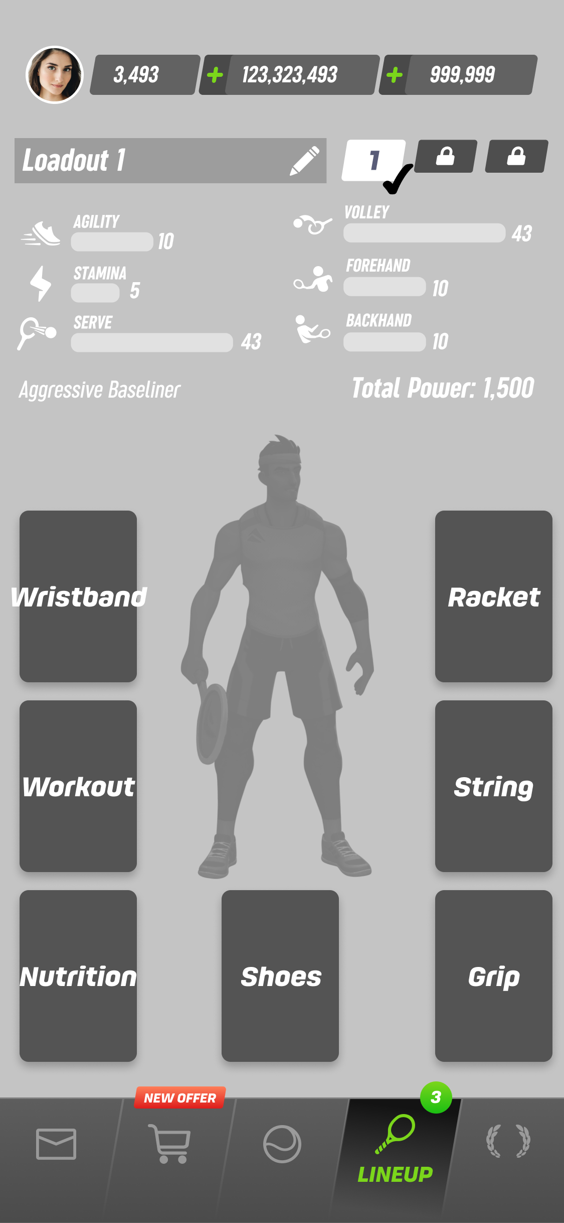
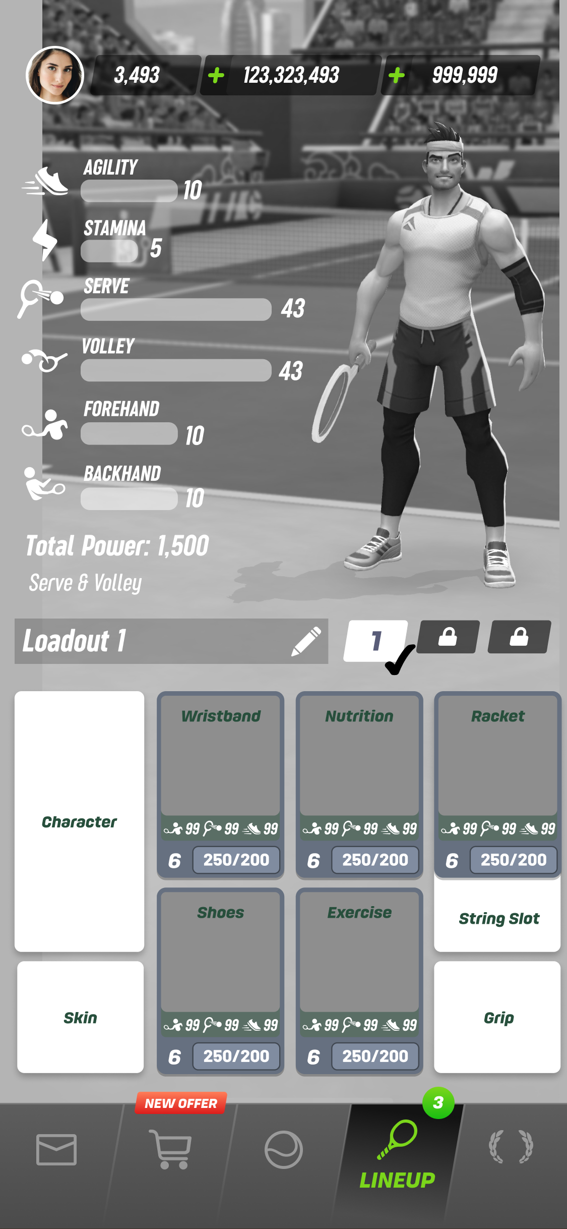
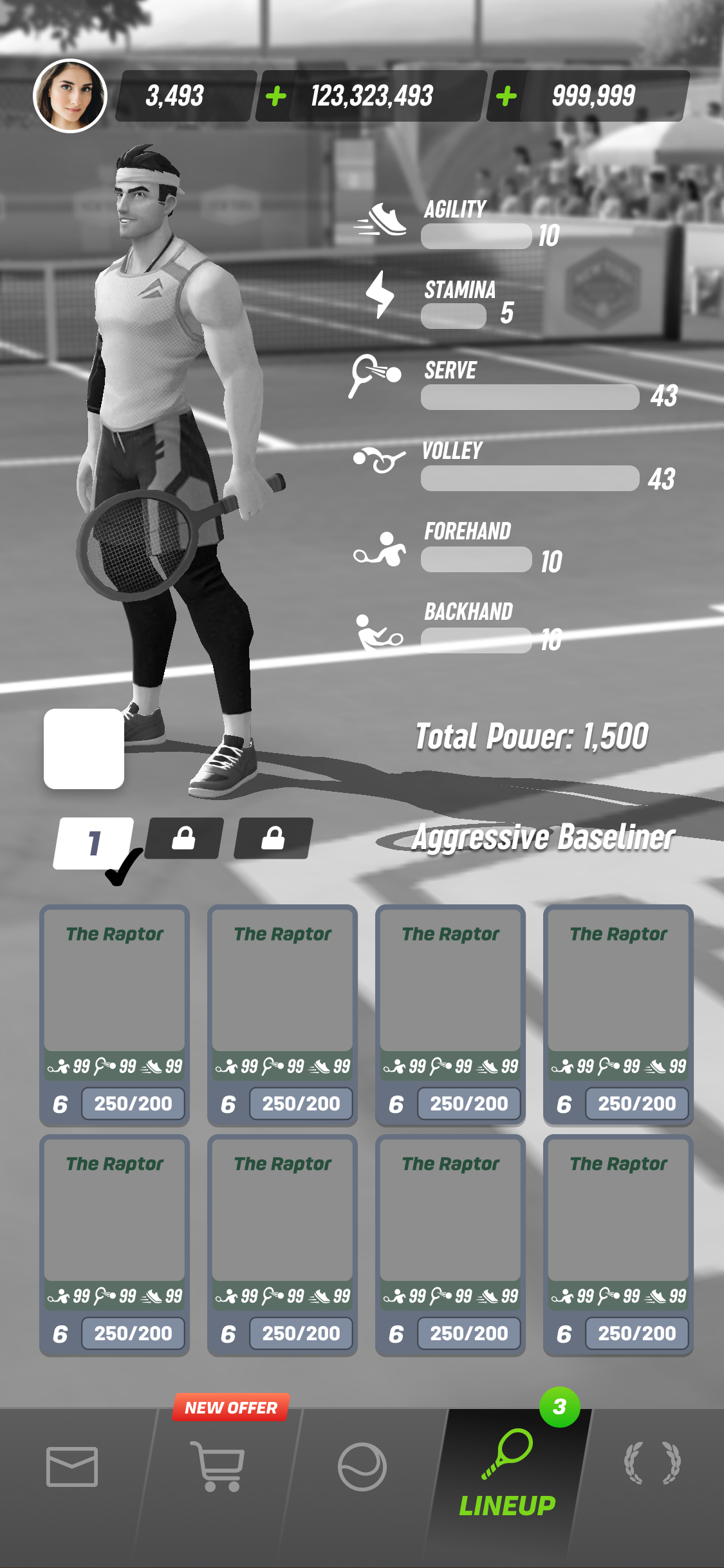
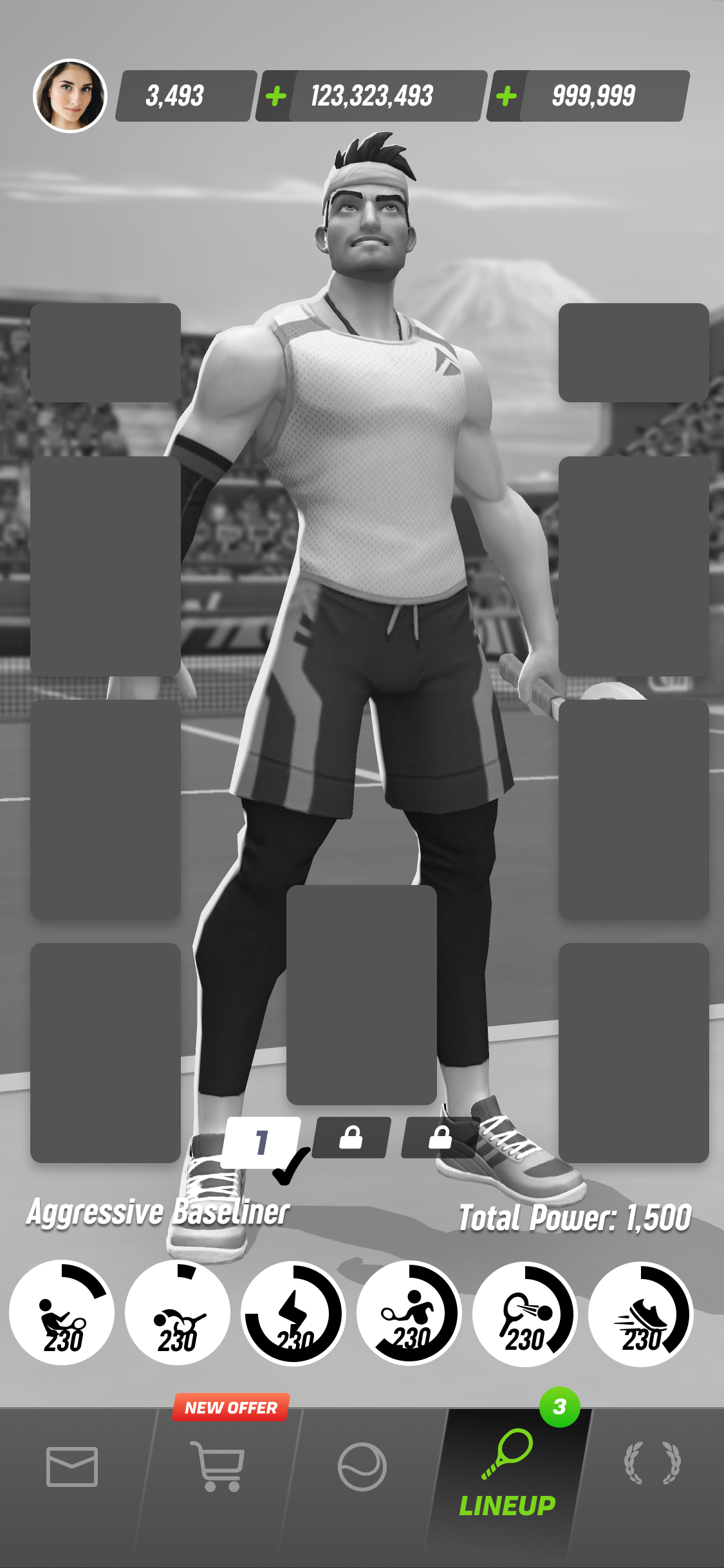
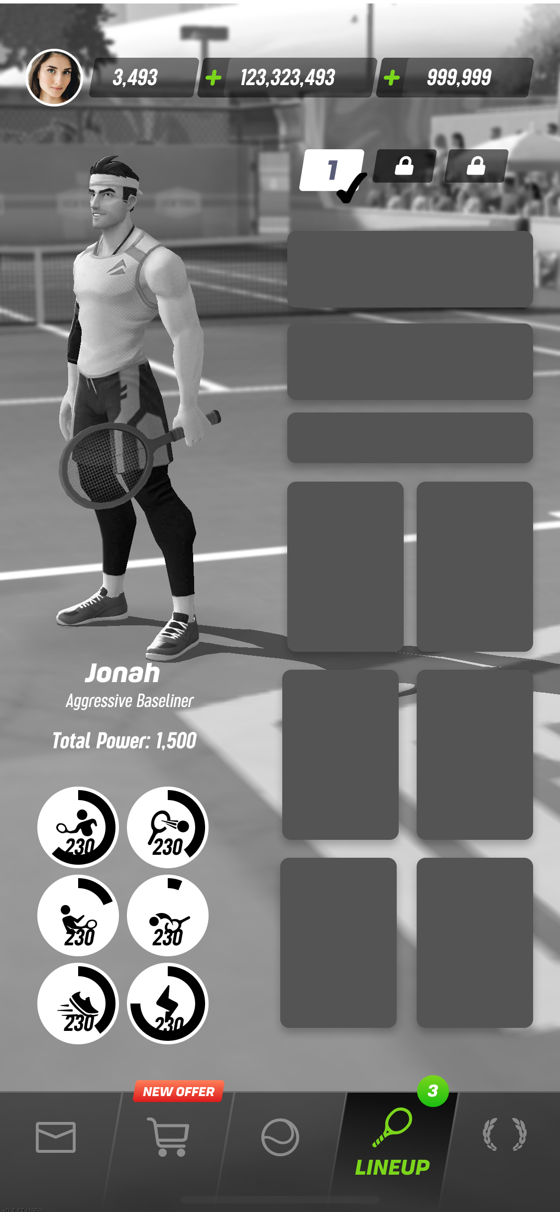
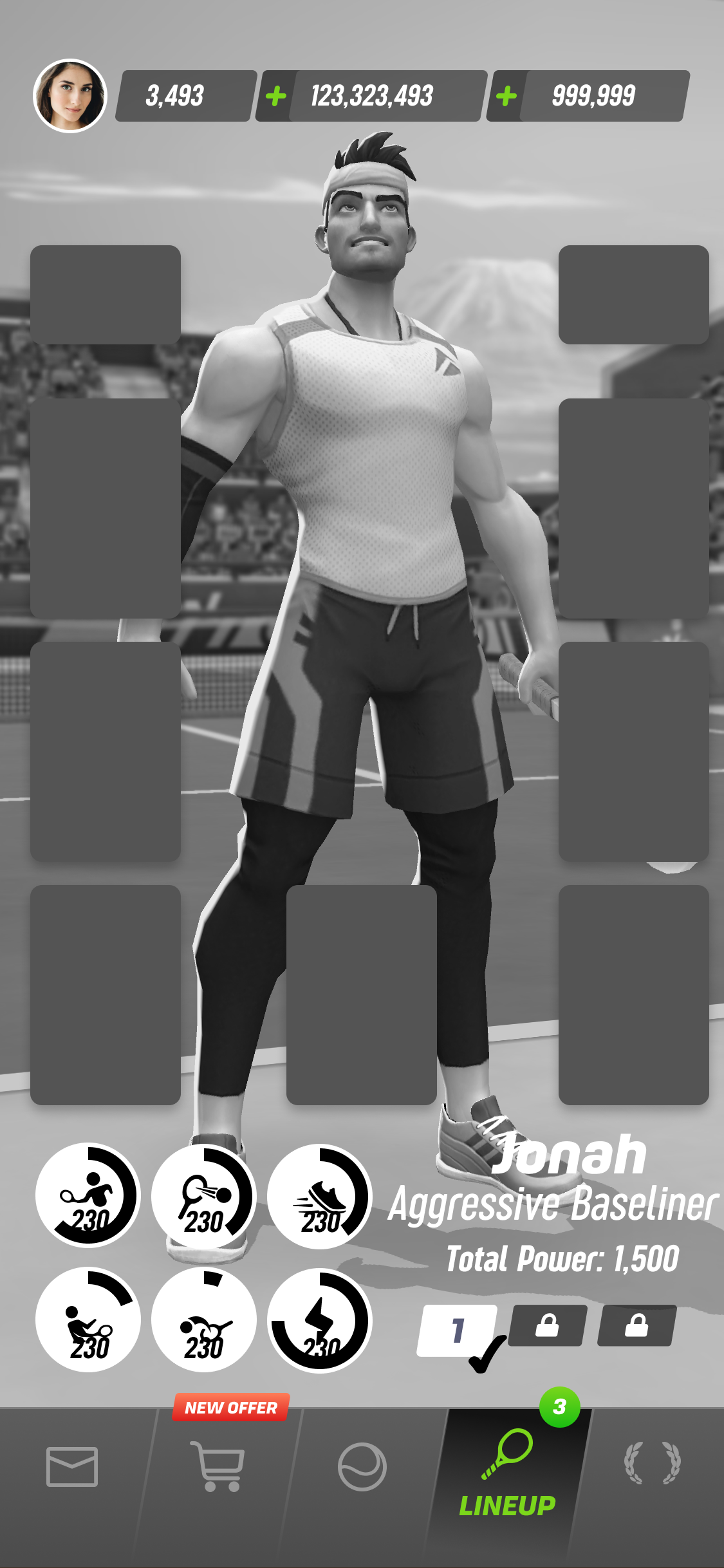
Prototype
Here is one of the prototypes I made to visualize the proposed solution. This was made using Principle.